
Work

Work that earned its place.

Every one of these had a date, a budget and somebody who could say no. Naming through to the pallet, and in several cases the website and the store after it. Several of these clients came back the following year.
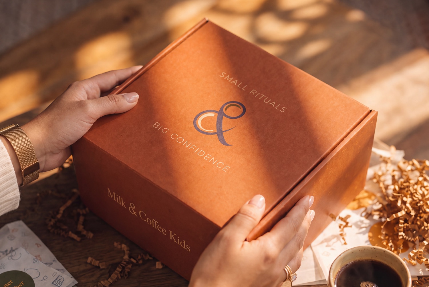
The closed mailer held over the table, the ampersand mark and both lines of the lockup printed across the lid, cards and a coffee beside it
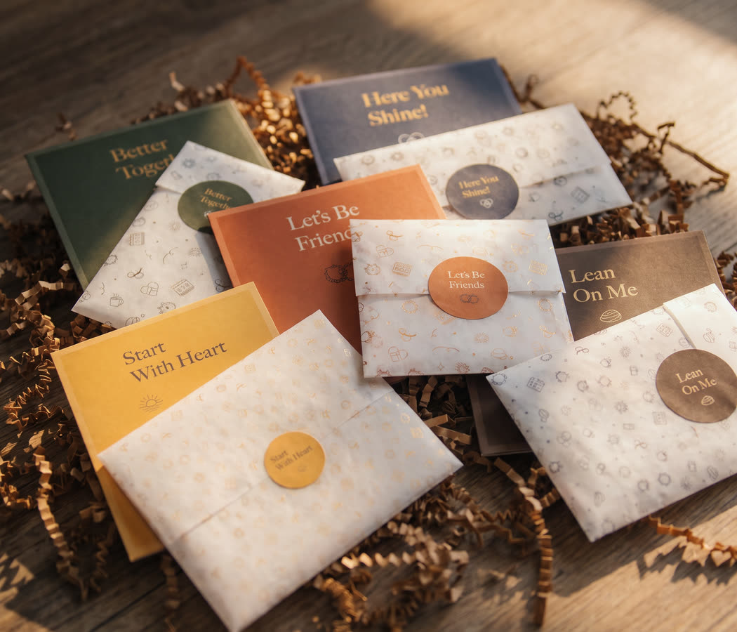
The five activities laid out: each card with the translucent sleeve it ships in and the colour coded seal that closes it
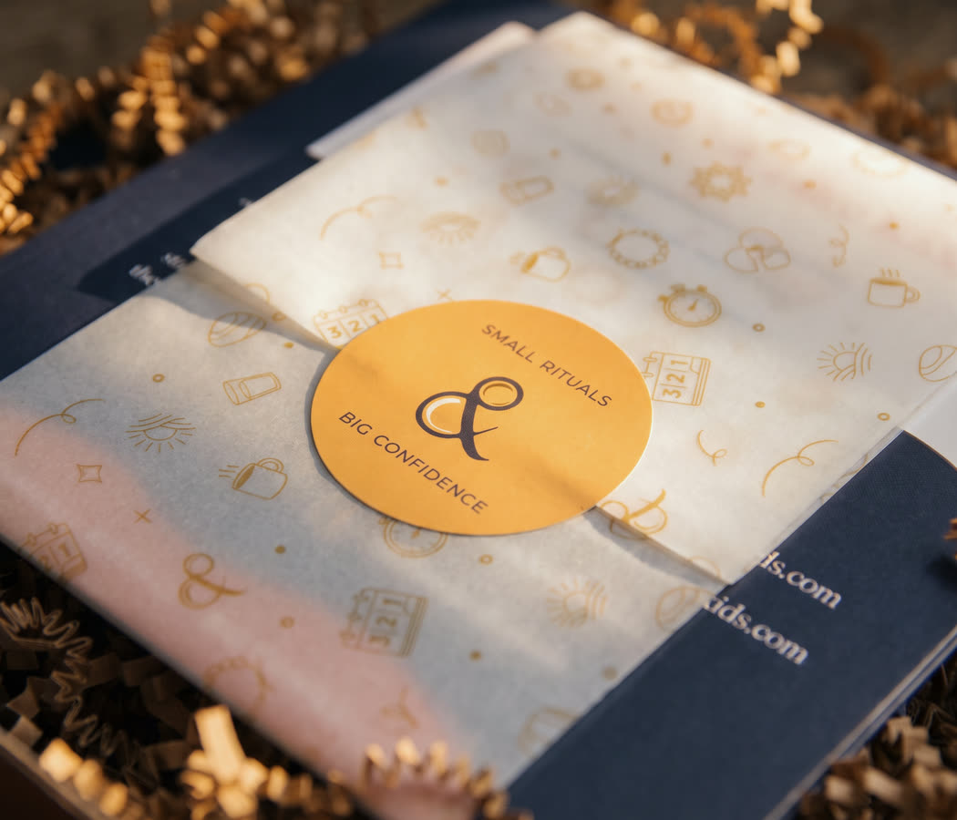
Close on the box seal, the ampersand and both lines of the lockup, sitting on the printed vellum
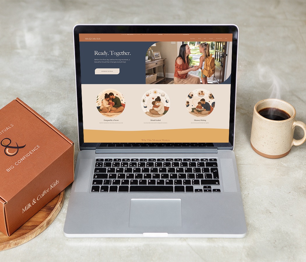
The shop open on a laptop, the home page showing the three ritual cards, with the closed mailer and a coffee on the counter beside it
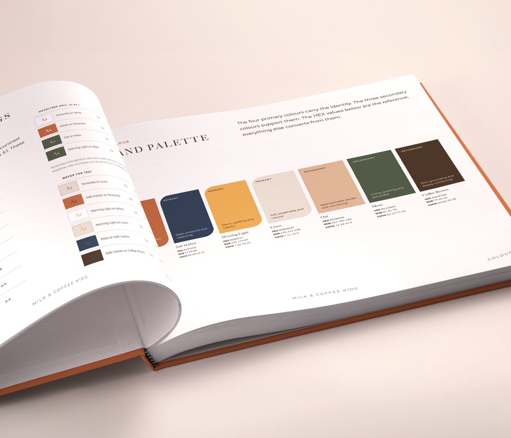
The printed brand guide open at the colour palette, each swatch with its values, and the pairing and contrast rules on the facing page

Project 01

A business that did not exist yet

This one started before there was a name. Research and positioning first, then the name, the identity, the product and every component inside it, the packaging, the shop and the direction of the photography. All of it built from nothing against a fixed seasonal date.

  • Market research, SWOT and positioning
  • Brand naming and strategy
  • Differentiation strategy
  • Brand identity
  • Product development and packaging
  • Website design and build
  • Photography direction

The first piece of work was not a design. It was deciding what the company actually sells. Not a box of activities, but a ritual for the moments childhood turns on: a first day at a new school, a move to another city, a family changing shape, a loss in the family. That sentence decided everything after it.

The name is a cup of coffee and a glass of milk on the same counter: the parent and the child, side by side. The cards, the seals, the shop and the photography are the same answer in different materials.

Milk & Coffee Kids. milkandcoffeekids.com

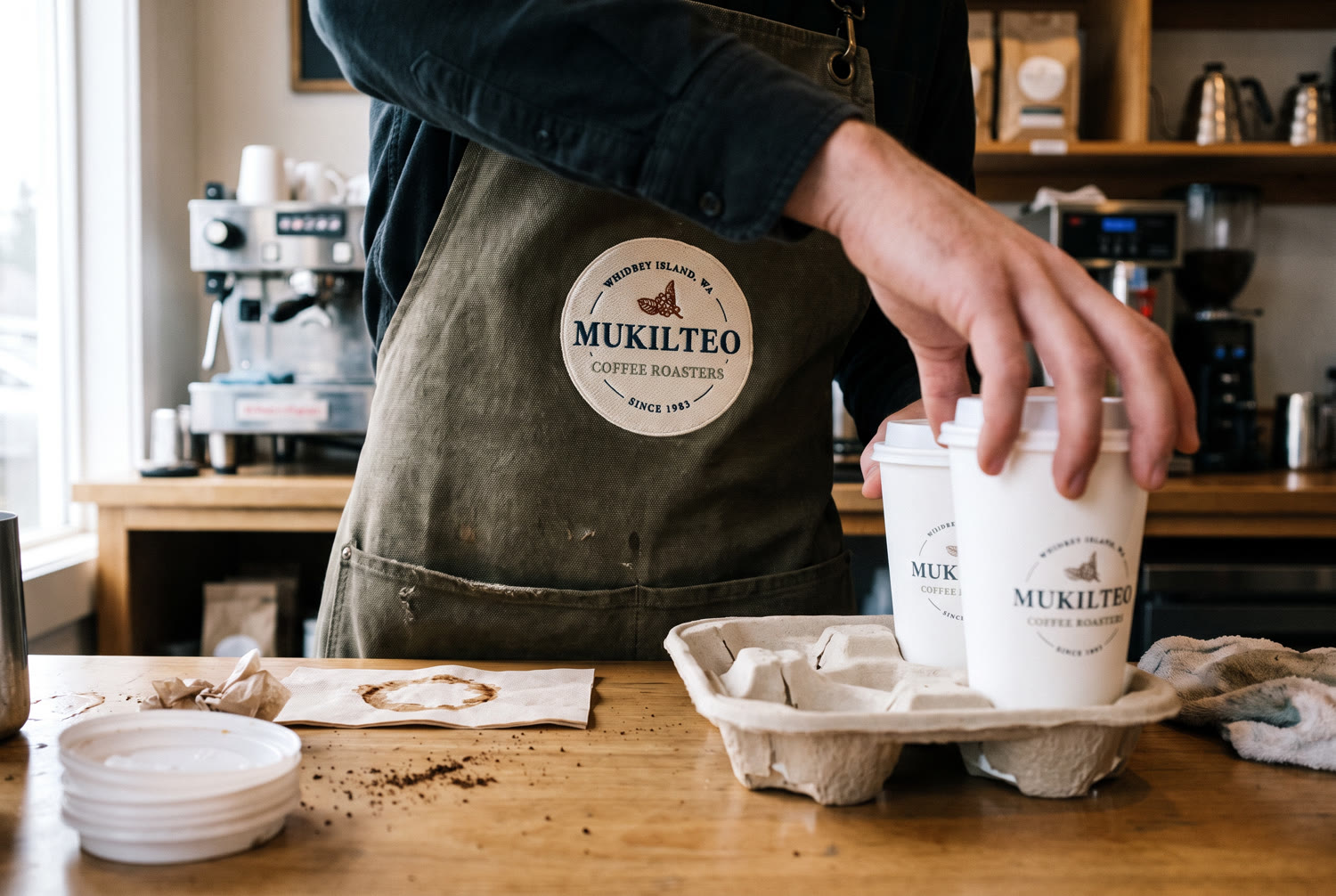
A barista in a canvas apron carrying the embroidered Mukilteo badge, setting two branded cups into a carry tray
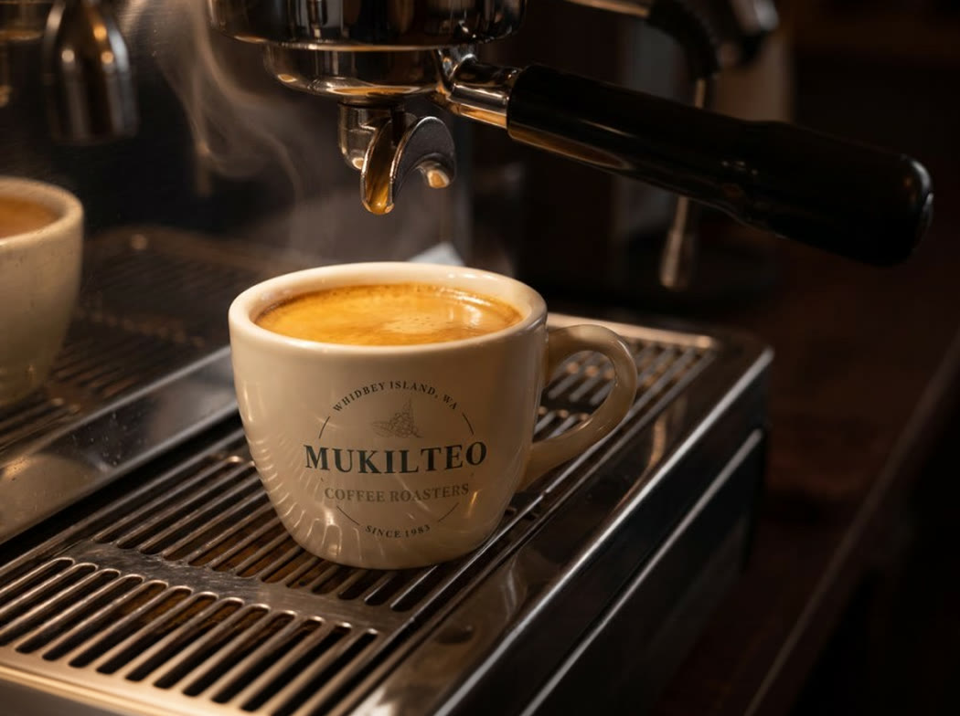
A branded ceramic cup standing whole on the drip tray beneath an espresso machine group head
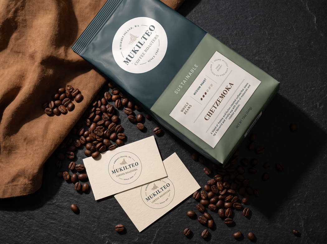
The coffee bag with business cards and loose beans on a dark counter
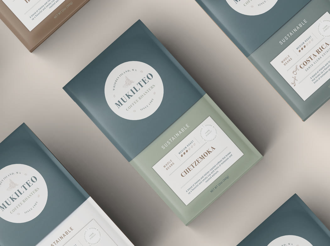
The bag range laid out flat, each roast with its own colour and origin card

Project 02

Forty years to carry across

A roastery with forty years of standing behind it, moving to a new mark. The risk in a change like that is never the drawing. It is the goodwill: regulars have to recognise the place before they read the name, so the new mark had to arrive already familiar, and hold at every size from a bag on a shelf to a badge stitched onto an apron.

  • Re-branding
  • Packaging and labelling

MSBDS. msbds.org

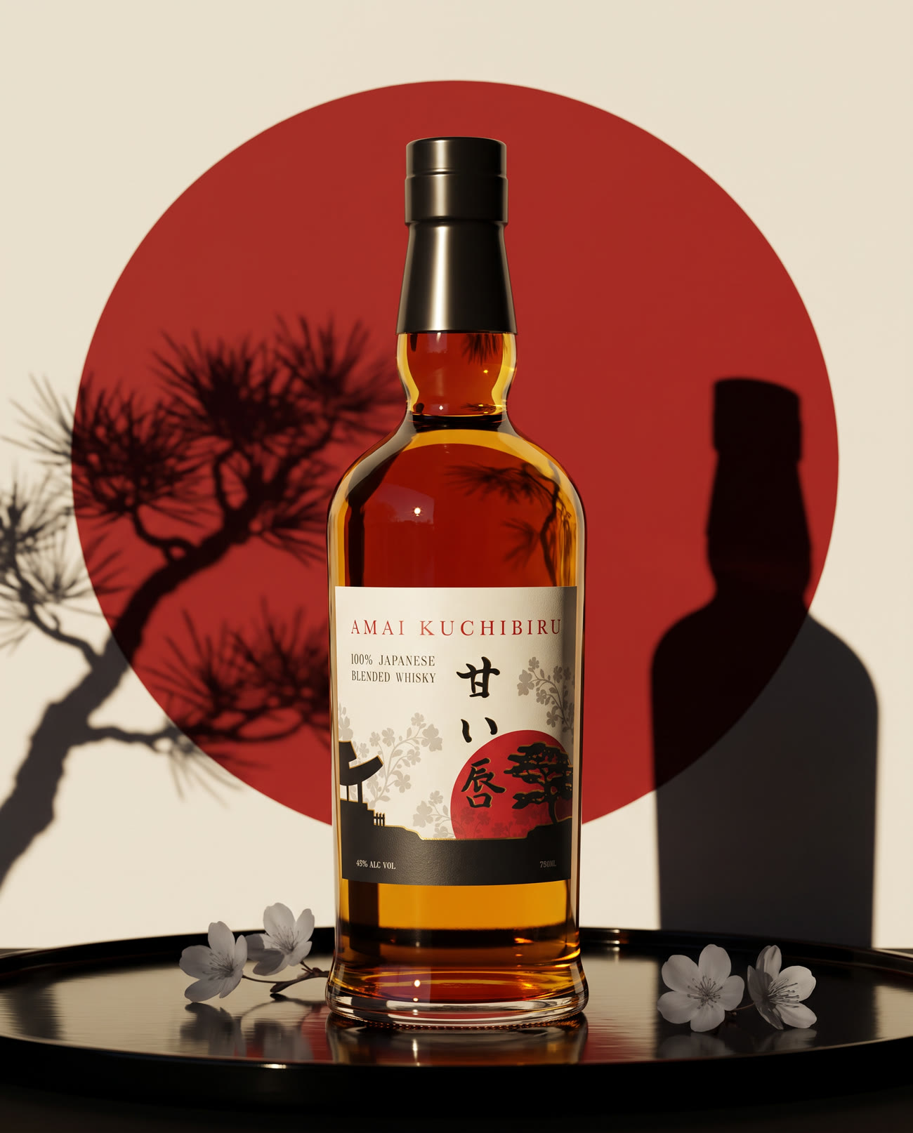
The whisky bottle on black lacquer against a red sun disc with a pine shadow cast across it
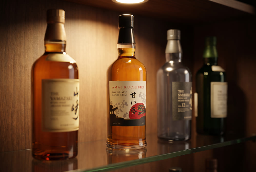
The bottle lit on a liquor store shelf among other Japanese whiskies
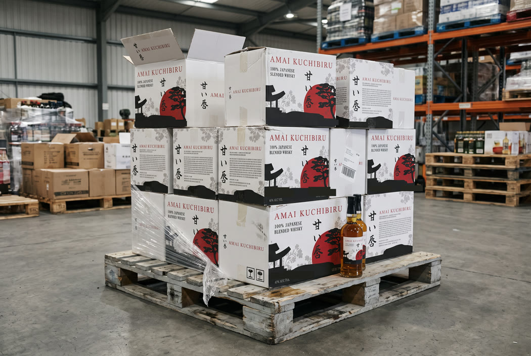
Branded shipping cases stacked on a pallet in a distributor's warehouse
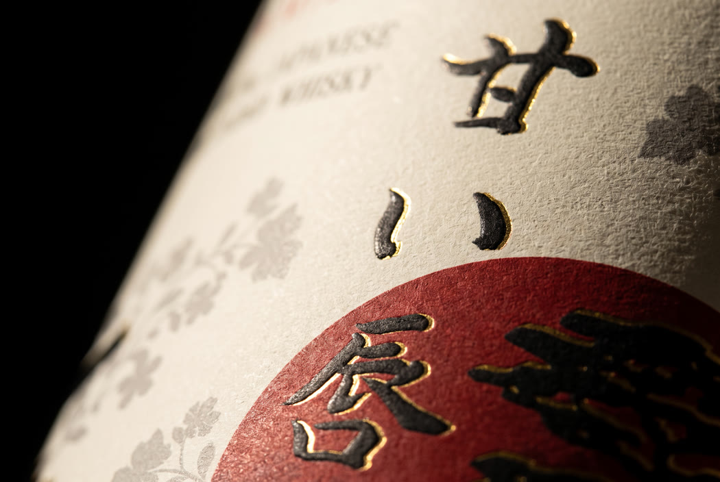
Macro of the gold foiled brush characters on the label

Project 03

A label with nothing to hide behind

A blended Japanese whisky drawing on a tradition it does not come from. A label has to put the first sip in someone’s mouth before the bottle is open, and that is most of what it is for. The line to hold is respect on one side and costume on the other, and it is held in what gets left out. Then the same restraint has to survive a twelve bottle case and a warehouse.

  • Label and closure
  • Case design and die line
  • Trade and retail rollout

MISA Imports. misaimports.com

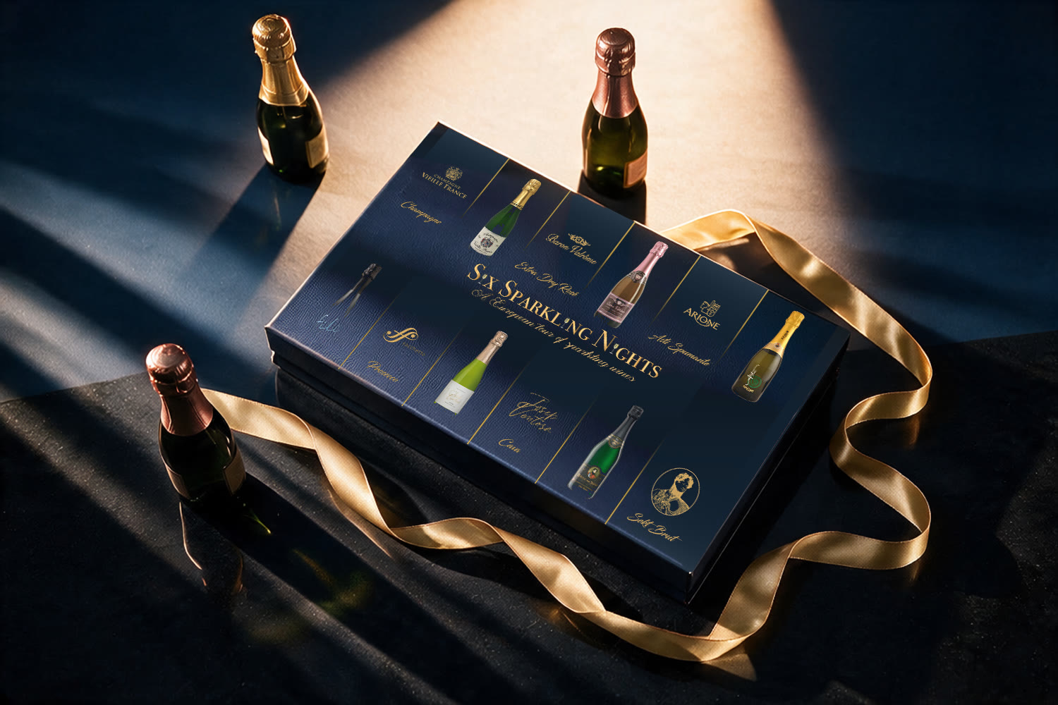
The 2020 box closed under a shaft of low light, three unopened miniature bottles around it and a gold ribbon trailing across the front

Project 04

Three years, three versions

A seasonal gift set redesigned for each of three years running. Gifting lives or dies in the four seconds someone spends deciding whether this looks like enough of a present, and the structure has to survive a pallet in a warehouse club and still open like an occasion.

  • Brand identity
  • Pack structure and surface design
  • Product development
  • Annual seasonal editions

The part worth knowing is that the warehouse club came back twice. A first season is a brief. A third is a verdict.

MISA Imports. misaimports.com

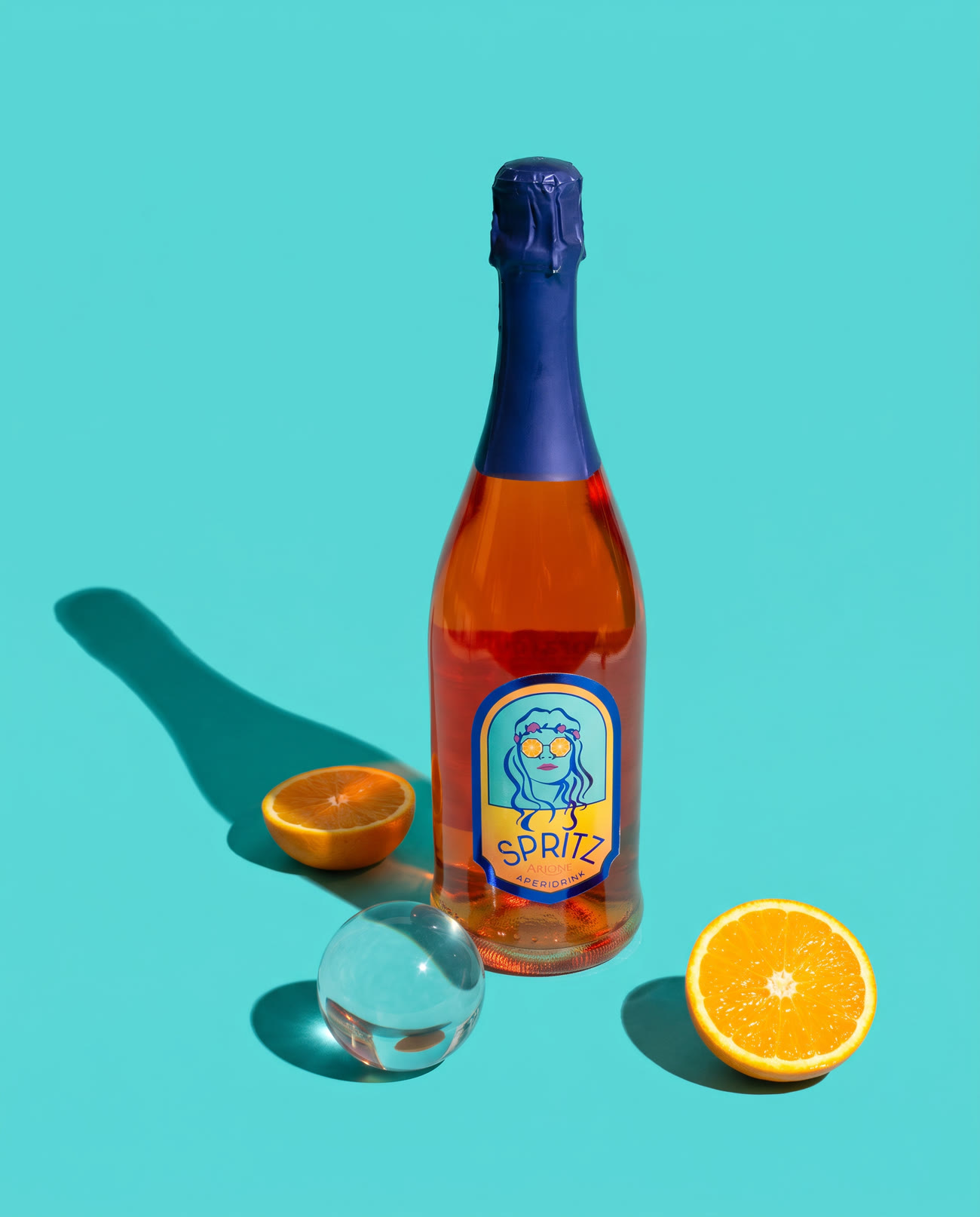
The Spritz bottle standing on a saturated turquoise ground with a hard cast shadow, cut oranges beside it
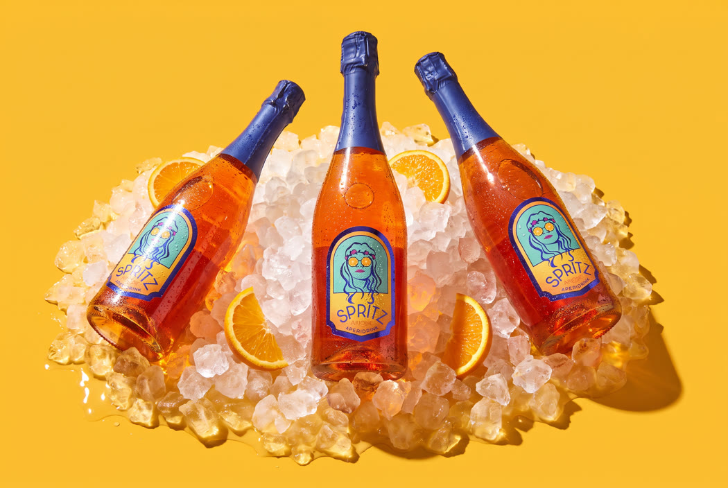
Bottles set into crushed ice on a yellow ground
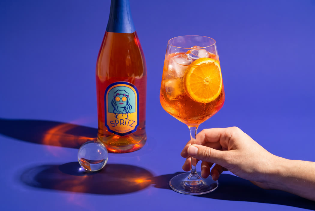
A poured glass with ice and orange, the bottle behind it
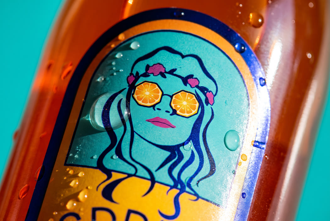
Close on the illustrated face and the orange slice lenses, wrapping the curve of the glass

Project 05

A category everyone had already entered

An aperitivo going onto a shelf already lined with orange bottles that look like each other. The label has to finish its argument before anyone picks it up, so the drawing has to carry at three paces and still reward you at arm's length.

  • Brand identity
  • Label illustration
  • Packaging
  • Product development

Inside the label

The photograph, the drawing in four stages, the label it became, the terrace the colour came from, and the five values it settled on.
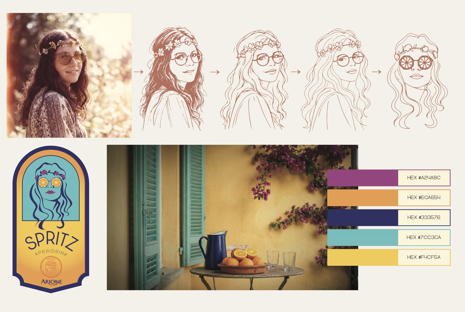
The path from photograph to mark: the reference portrait, then the drawing in four stages from hatched sketch to the final contour with orange slices for lenses, the finished label, the terrace the colour came from, and the five values with their codes

Sampled off the artwork, in the order shown: #FCCF3A ground, #5EC7CD sky, #322F7D line, #FAA43E lenses, #B23E91 mouth.

The magenta turns up twice, on the flower crown and on the mouth. The red everyone remembers is the drink behind the label, not the label.

MISA Imports. misaimports.com
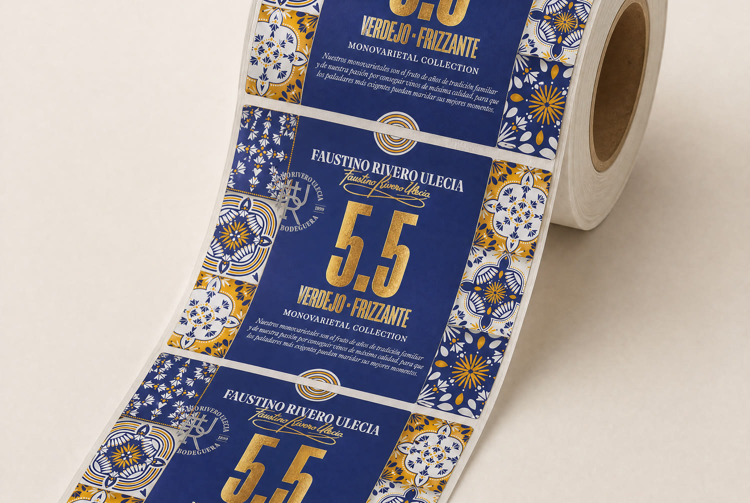
The printed labels coming off the roll, one whole label centred, the tile border repeating down the web
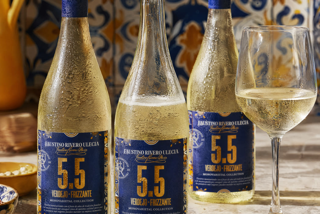
Three bottles on a stone counter against the same blue and yellow tile the label border is drawn from
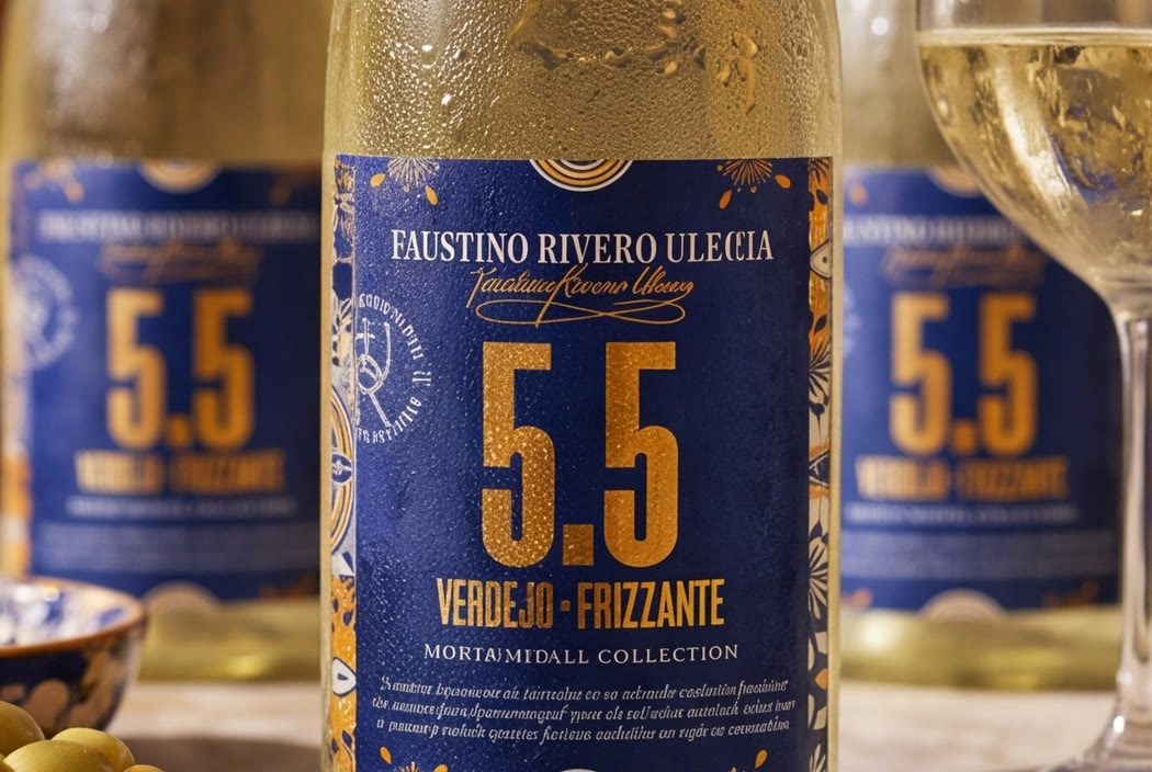
Close on a chilled bottle, the label front on and legible, olives and a poured glass beside it
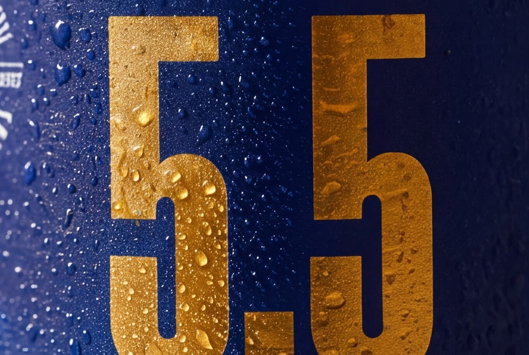
Macro of the raised gold five point five on the blue label, catching the light through the condensation

Project 06

A shelf of labels, one after another

Wine and spirits labelling across a range of producers and price points, and the one shown here is a monovarietal frizzante built to read across a room, followed from the roll it is printed on to the bottle it ends up on. Different houses, the same discipline: the label is the only salesperson present.

  • Label design
  • Range architecture
  • Production artwork

MISA Imports. misaimports.com

Client names appear once each client has agreed to it. Projects still being photographed are marked as such.

Next step

Bring the decision you have been putting off.

Forty-five minutes, no deck. You should come away with a clearer read on it whether or not we end up working together.